


Cool Summer Colour Guide - Part 2 HUES
Anni Wickham

For the second blog in the Cool Summer series I am going to analyse your colours - your HUES. I’m going to start with the mood of the palette and try and get an image into your mind. The inspiration for the colour palette came from the founder of Sci Art, Kathryn Kalisz who developed the twelve season palettes that were the starting point for those I use in my studio.
“The tone of the True Summer is cool, refreshing and serene. In gently mixed shades of soft pastels, the True Summer tone, like a breath of fresh air lends comfort and relaxation from the hurried pace of life. With the blues of cool still waters, this tone beckons you to its side”
For me in the UK, I think of the beautiful gardens in Kent - still lakes, beautiful flowers in shades of pinks and purples under a summer sky. A place to be calm and relaxed.
Words associated with Cool Summer are:

I have many images on a pinterest board if you want to absorb yourself

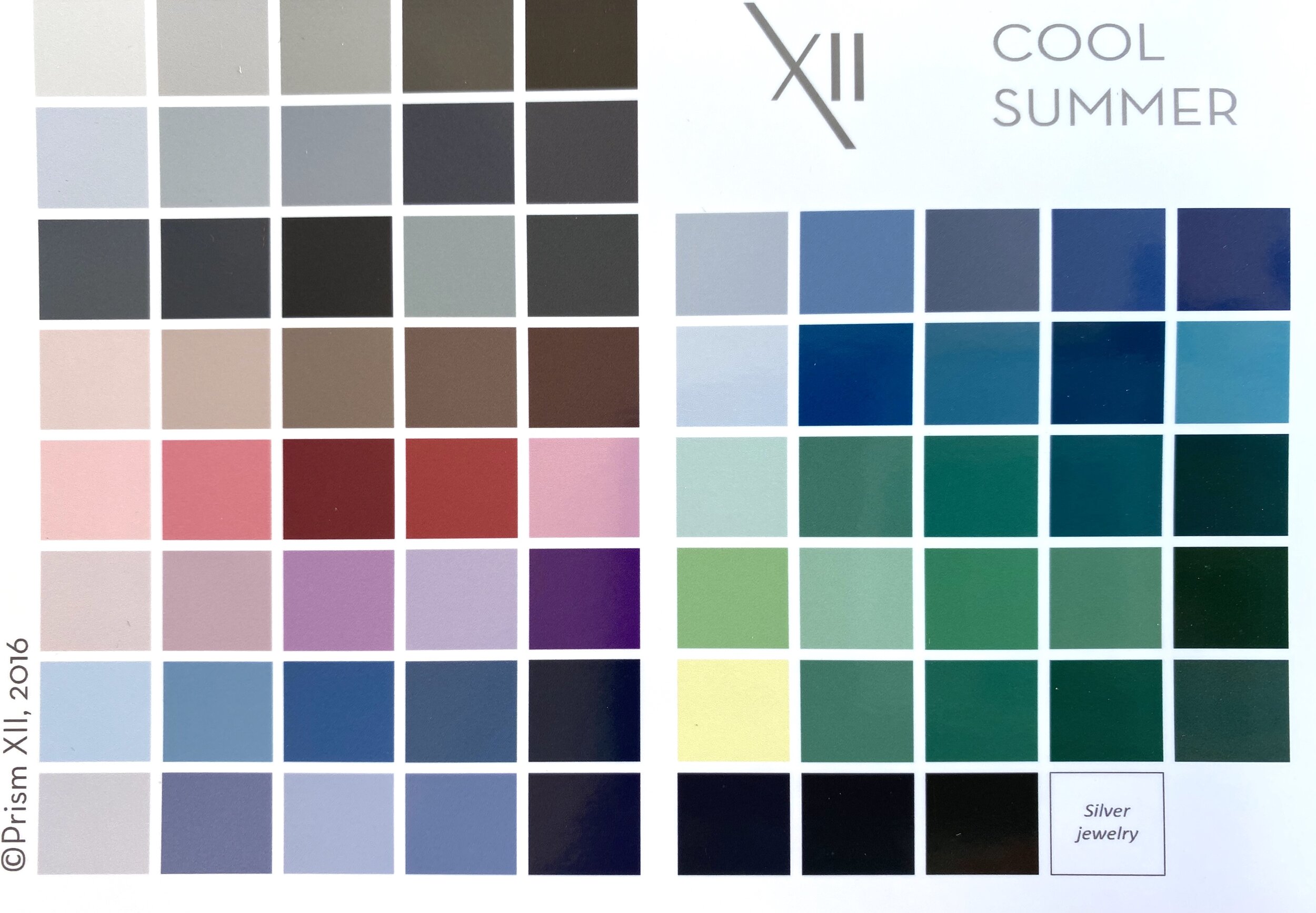
The very interesting thing about your hues, are that they are so limited. They are really focussed upon your natural colours and with no complimentary colours present - the colours that are opposite to your natural colours on the colour wheel. It is the most extreme example of the seasons, driven by the fact that you can only wear totally cool hues. When I lay out examples of each hue into a colour wheel, this is what I get….

Cool Summer has virtually every shade of blue going (except the ones with a lot of red in them that belong to Cool Winter), it has a wide range of cool pinks and blued purples, and the one that surprises a lot of my clients - a beautiful collection of green-blues and blue-greens. Within the neutrals you will find a wide range of tinted greys on the next post. Together these colours blend beautifully- blending being a key word. Your colour wheel has no bold contrasts but is more sophisticated and serene.
What is very obvious, is that this is only half of a wheel. Here is the other half with the colours in it that you should never wear. Any shade of red and especially warm reds; any shade of brown with the exception of cocoa brown which has a pink undertone; and shade of beige, cream, gold or mustard; and any shade of green that does not have a blue undertone - grass green, lime, olive or khaki.

No more expensive mistakes when shopping. We have just made your shopping easier.
The Cool Summer Palette
I use Prism Xii palettes and fans in my studio. I think that they blend together beautifully.
Now that you have your COOL HUES, we need to start to combine them to make outfits. We have not discussed neutrals yet, they will be in the next blog, so for now I am going to show you examples of colour combinations that suit the calmness of the mood of this season. Monochromatic combinations where you choose several shades of the same colour are perfect, you add your personality with the style, texture, prints and accessories.

The more you can blend colours together, the better. The second sort of combinations you can make is analogous where colours sit near each other on the colour wheel. Again, how you put these colours together and accessorise them is where you add your unique personality.

That finishes the section on HUES, next up will be NEUTRALS - those all important supporting pieces to the colours that we have looked at on this blog - and incredibly important to Cool Summer.
Please do comment on the blog and keep following the series
Thanks
Anni x


