Prism XII Palette Fans now Available to Buy on My Colour Stylist Website

Anni Wickham

I am very excited that Nikki, the founder of Prism XII has allowed me to start to sell her fans. Nikki trained me and has worked closely with me as I have developed the business and extended the swatch business. Nikki has been selling the fans from the US but since the UK has left the EU it has become harder for her to export and time delays are happening for her clients, so this is a perfect solution for us both.

I already use the fans in the studio and sell them to clients, so this now extends my offer to the website - hurray! Lipstick wallet cards and mini palettes will be next to be available.

Why am I so excited? Because these palette fans are different and have been the base for my selection of swatches for each season, so I work with them all of the time.

p1474739401-4.jpg

In Nikki’s words :

The 70 colours presented in your palette are CORE colours for your seasonal tone.

The 12 seasonal tone palettes have been created using authentic, accurate Munsell colours. They are created using the Hue, Value and Chroma dimensions of all colours that were first identified and notated by Albert Munsell in the late 1800’s.

Each colour in the palette has been taken from one of 10 Munsell Hue pages, known as plates: Red, Red-Purple, Purple-Blue, Blue, Blue-Green, Green, Green-Yellow, Yellow and Yellow-Red.

Each of the seasonal tones logically fits into the Hue plates at a specific level of Value and Chroma. There are no cross-over or combinations. Each colour is unique to it’s individual palette.

Your skin has a Hue (Warm, Cool or Neutral), a Value (Light to Dark) and a Chroma (Bright to Soft/Muted) level. Once these characteristics have been identified, during a personal colour analysis, the colours presented in the palette provided are balanced and harmonised at a similar level on the Value and Chroma scale.

For example, if Dark is the dominant dimension/characteristic required to create harmony with your skin’s undertone, the colours in the palette can all be found in the low Value colours on each of the Hue plates. Likewise, if Soft is the dominant dimension/characteristic of your tone, then all the colors have been chosen from those that have the lowest level of Chroma/Saturation.

p1474738914-4.jpg

The 12 seasonal tone palettes contain only 830 colours of the 1500 Munsell colours available. The colours were objectively chosen to represent the very best colours to be worn by a person with your skin undertone. The colours are the best you can wear, They are the A+ colours for you.

The goal for creating the Prism XII palettes was to select colours based on the Munsell notations that closely match and harmonise with your skin’s undertone in Value and Chroma. The colours in each palette can be measured using a Spectrophotometer to confirm their similar dimensions in Hue, Value and Chroma.

Other palettes on the market may present colours that are not found in the Prism XII palettes. This is due to the fact that they are not accurate or scientifically correct in the Munsell “colour space”.

p1474743922-4.jpg

So, even easier than ever to buy a Prism XII palette fan. Whilst I love them all - I think that the Soft Summer and Soft Autumn palettes are exceptional and by far the best available on the market. The softness and harmony in these two palette fans helps to stop these seasons looking dull and makes them exquisite.

I will update you as soon as the mini wallet cards are available in the shop.

Stay safe

Anni x

Virtual Colour Analysis - Yes I have Changed my Mind !!

Anni Wickham

Since I launched the “Create your own Seasonal Palettes” more and more clients are asking for advice on which colours are right for them. Over the past six months I have been looking at their photographs and directing them towards their best colours. It never really felt as good as seeing someone in the studio - there I see the drapes react with clients’ skin tones and eyes. I still would recommend having a personal colour analysis with a colour analyst in person - if you are in the studio I can assess so much more about your lifestyle and personality - I can see how you react to the colours as well as seeing how the colours react with your features.

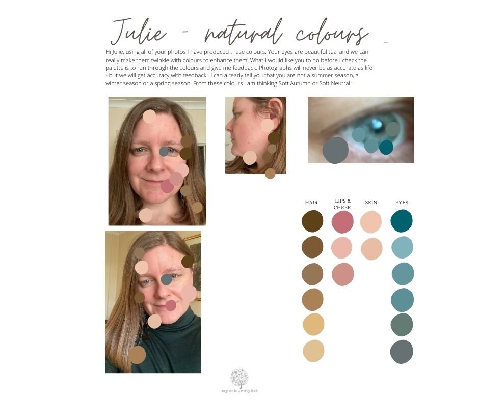
I had a bit of a breakthrough recently when I started to send colours back to clients to confirm their natural features and get feedback on how accurate my colours were. Tweaking the colours until the client was completely happy that I had an accurate representation of their features I could then create a palette for them knowing that it would be a good representation. This is what the first step looks like :

FB Julie Virtual Colour Analysis.jpg

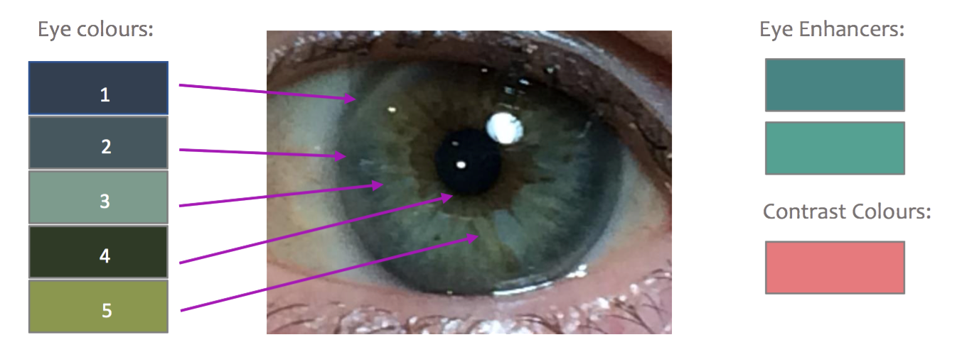
Once I have the colours agreed, I start to use them as a base. I can enhance the eye colour, find lipstick colours, create a base for neutrals and find complimentary colours. I can create a small palette or large according to what the client wishes. Shantae in the next photograph bought all of my Dark Autumn swatches at a cost of £110. It is a pregnancy treat so that she can plan her post pregnancy wardrobe - what a fabulous idea! We discovered from several photographs of Shontae that when she tans she becomes golden, but in the winter (especially in lockdown) she becomes a little paler and cooler. It took us a couple of days to pin down her natural features which were Dark Autumn, but with a couple of significant changes. She has more contrast and is more like a Dark Winter in that she can wear black or near blacks with soft white or lights. Most Dark Autumn palettes do not have any lights in them. We also needed to add some brights for highlights for this young mum to give her some energy to cope with those long sleepless nights. Bright Spring gave us the lights which Shontae loves, and Warm Spring gave us the brighter highlights which really compliment the palette. Step two below:

Shontae Insta.jpg

Being the detailed person that I am, I love to understand where each client fits into a season and how the palette needs to be tweaked to give their unique features the perfect palette. I look at their value, hue, chroma and contrast comparing them to the typical dimensions of the seasonal tone. Writing a short report to give guidelines on the dimensions of colour, how to combine the colours, guidance on make up colours (I am not a make up artist), and even a personalised colour wheel all gives the client more information than they would absorb in a personal colour analysis in my studio. I am now going to have to rethink my studio sessions to add in a report as I think it is so good to have the detail in hard copy.

This is the report that I sent to first client after we had finished her palette. She gave me a fantastic review and started shopping online straight away. Result !

Your Natural Features.jpg
Your Palette.jpg
How Soft Autumn Fits with the other Seasons.jpg
Your Colour Dimensions.jpg
5.jpg
Make Up.jpg

The report comes as a PDF document ready to print on A4 paper. These clients all found the process enjoyable and felt involved throughout. I got to connect with clients and create unique palettes which is what I enjoy to do most. All of the clients started their journey with me because they wanted to buy swatches. It was easy to choose from the palette as I put names of swatches under any colour that I had fabric swatches available to make. The whole process took about five days with many Emails.

Due to the time involved, I am only going to do three a week for the short term and then review. I have put a listing onto my shop with three units of stock and I will restock as I get free time.

Lockdown has just moved my business into yet another direction.

Would love to hear what you think

Anni x

Value Contrast and Colour Contrast for all Season Tones Explained

Anni Wickham

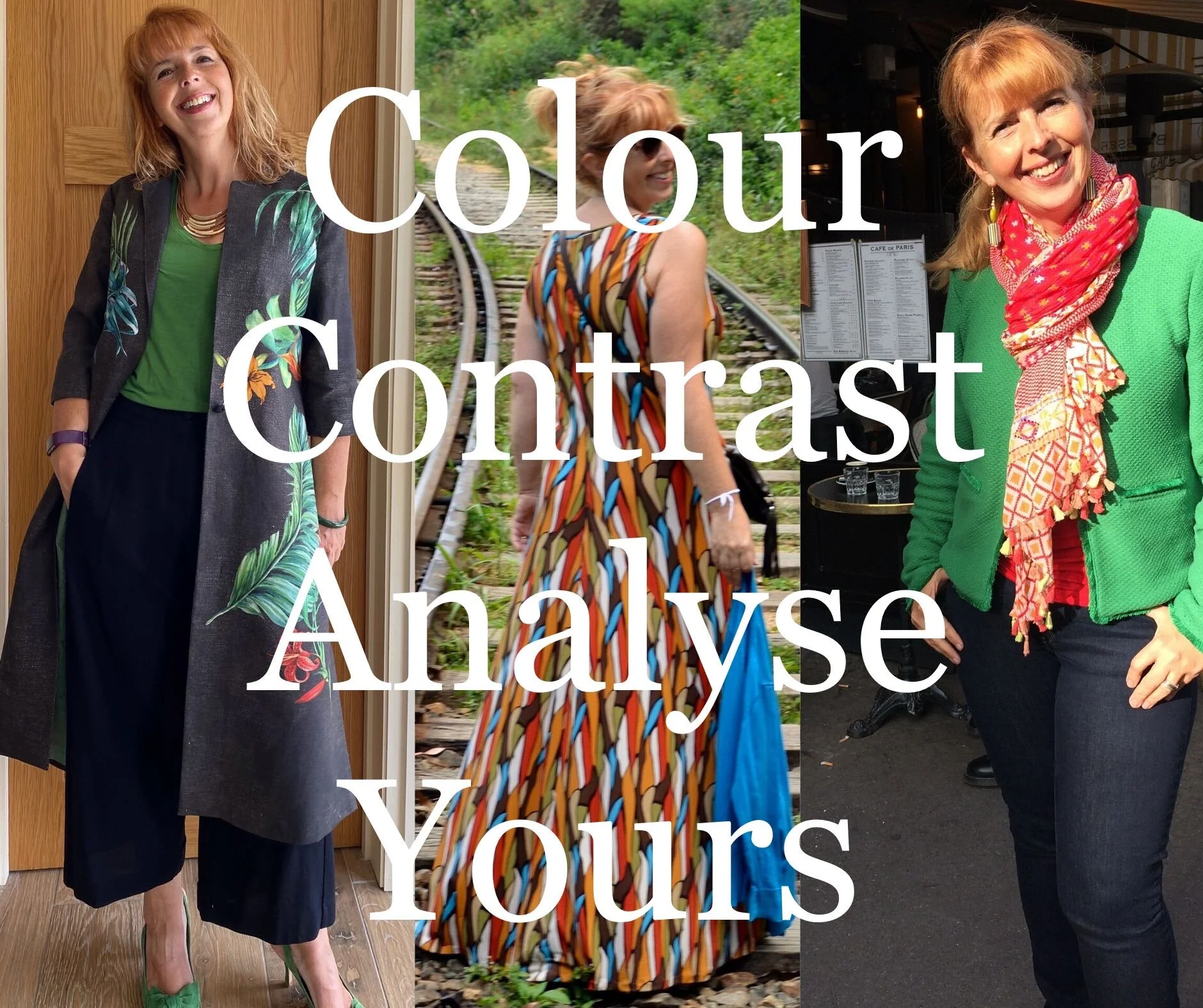
How should you put your colours together? Can you wear black and white? Can you wear only an accent of colour or should you always wear two colours. Should prints blend or contrast? This blog answers these questions for each season tone from the high value contrast winter seasons to the high colour contrast spring seasons.

Read More

Analyse Your Value Contrast

Anni Wickham

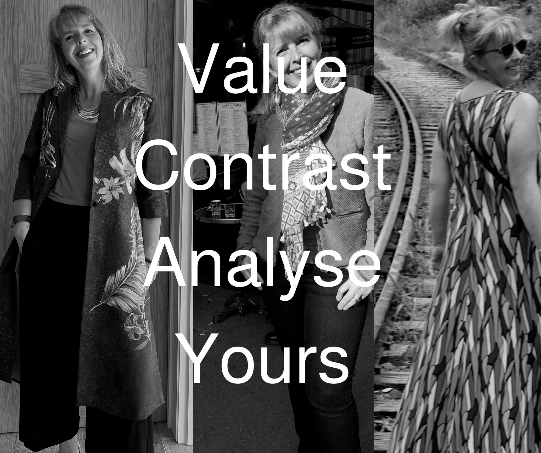
Contrast is a very important part of colour analysis. The last post discussed COLOUR CONTRAST, this one discusses VALUE CONTRAST. VALUE CONTRAST is the difference between your darkest and lightest values. I show you how I analyse my VALUE CONTRAST and how to analyse your own. There are examples of low, medium and high value contrast women.

Read More

A Brave Man

Anni Wickham

Only five percent of my clients are men - yet they invest a lot of money in their formal clothes and wear these items many times. Even more than women it is important that choices for suits are the best they can be - black is not always the most flattering colour and can make you look tired, washed out and older - not the impression most men would want at work. Here Jim discovers charcoal and navy with shirts and ties in light blue, ice pink and white make him look more energised and youthful than his previous black suits and white shirts.

Read More

Launching Soon .....Create your own colour palette with over 500 fabric swatches

Anni Wickham

I am excited to be pulling together five hundred swatches from which you can select your own unique packs. I am going to put ten of my recommended colours in a suggested pack, and new for me, but probably more important to your wardrobe - I am going to put together ten recommended neutrals / key colours in a pack and again give you options to play with. If you are going to stick with one season, then you should have at least forty swatches to select from - buy one or more - as many as you wish. Unique on the market - because you are unique too.

Read More

Making Your Eyes Dominant

Anni Wickham

1) Complimentary colour contrast 

Once you have found your favourite eye enhancers that reflect your eyes natural colour, the next step is to find the complimentary colour to make the eyes pop. By offering a balanced opposite colour you are finding the highest level of contrast for your eye colour. This will intensify the colour of your eye and be the most striking choice. This is a good choice for lipstick, blusher, jewellery, scarves and clothing.

Find the nearest colour to the dominant colour in your iris on a colour wheel and look at the colour directly opposite: 

analyse4.png

Colour wheels are only 2 dimensional, and only display a small selection of colours you will find in make-up brands and in clothing. This is just an initial guide to start your search for your perfect colours.

If you don’t like the colour that is your complimentary one, then you have options. You always have options. This is about your personality and personal taste, more than it is about your natural colours. A colour analyst can show you a range of colours that will make you look vibrant, healthy and younger, but you bring yourself to the table. Choose from the palette the colours that reflect you and your lifestyle, or challenge the analyst to find them in the best colours for your skin tone. It’s two way. 

2) Triadic colour contrast 

If you found the complimentary colour too contrasting, or unflattering then your next research is based on a triangle on the colour wheel. This offers you two extra colours to test out.

Find the nearest colour to the dominant colour in your iris on a colour wheel and look at the colours at the two other points of the triangle: 

Colour wheels are only 2 dimensional, and only display a small selection of colours you will find in make-up brands and in clothing. This is just an initial guide to start your search for your perfect colours. A personal colour analysis session will find seventy colours to flatter your skin tone and make your eyes shine.

Choose from the palette the colours that reflect you and your lifestyle, or challenge the analyst to find your favourite colours in the best version for your skin tone. Remember - it’s a two-way process. 

My Favourite Eyeliners - Read More...

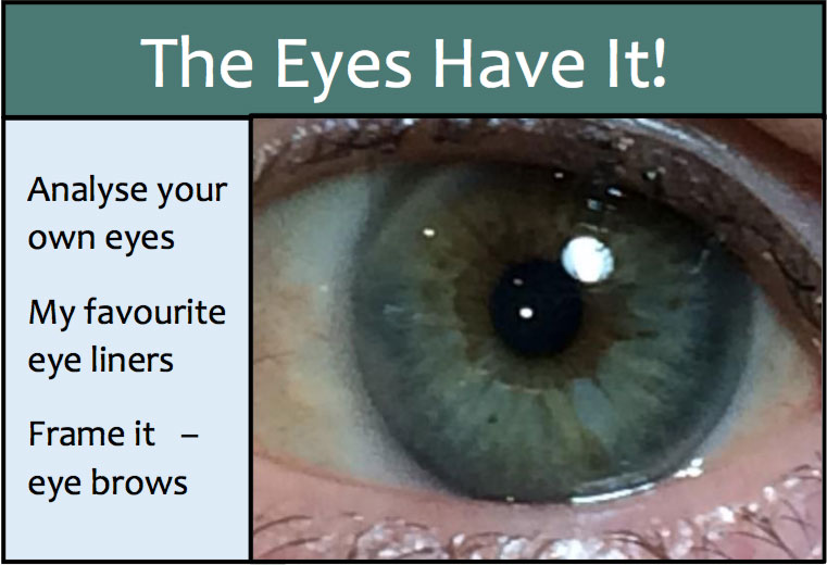
The Eyes Have It!

Anni Wickham

Eye contact is powerful. It is far more impactful than words or a smile.

We look into someone’s eyes to find their real emotions and to find truth. If the lips are smiling, but the eyes aren’t – we believe the eyes. We look for love and understanding by searching the eyes. We believe that eyes can twinkle with mischief or happiness. Equally we feel the sadness carried with tears and sorrowful eyes. We give away our feelings of attraction with enlarged pupils and increased eye contact.

When I am analysing colours, I am watching the face, for both the impact upon the skin tone and the eyes. The aim is to make the eyes stand out and sparkle - to become the focus of the face and the person.

By enhancing the eyes, we are focussing on the most intense and attractive visual expression of ourselves and our emotions.

I hope you find the blog posts useful. Please give me your feedback and share any products you have found. 

Blog 1

Blog 1

Blog 2

Blog 2

Blog 3

Blog 3

Blog 4

Blog 4

Frame Your Eyes

Anni Wickham

Eye brows direct attention to your eyes. They are like picture frames – they shouldn’t dominate but help draw attention to the work of art they outline. They set the focus point - your eyes.

Eye brows are fashionable at the moment. No more virtually plucked to baldness thin pencil lines, but bold and thick dominant brows. I am lucky enough to have naturally well shaped and thick eye brows, so until I started ‘my colour stylist’ I was unaware that I was lucky – or that for many clients, eye brow pencils are as important as lipstick to define the face.

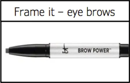
On one of my first appointments when doing the make-up colours for a client she was still looking expectantly when I had finished. She wanted defined eye brows – I had one choice in my kit – and of course it didn’t work for her colours at all. Nikki from Prism xii recommended this product to me, and now I am passing that on to you all – it’s great. It seems to adjust according to the colour of the client’s own brows and suits most people – I just need a lighter one for very white blondes, and a darker one for deep brown/black. 

IT cosmetics, brow power universal pencil in universal taupe 

frame1.png

Why I love it:

It is easy to apply in small hair like strokes – the oval tip lets you draw thin or thick brows

It is long wearing and doesn’t smudge

It looks natural and is easy to blend in with natural eye brows

It looks good on blonde, soft browns, mid brown and grey eye brows – a good tip is never to use an eye brow pencil that is darker than the roots of your hair.

It contains anti-aging ingredients and conditioners It costs £18 and can be find on line from £16 

My Favourite Eye Liners

Anni Wickham

One of the products that my clients buy first is a new eye liner. I like to use eye liner at the base of the upper lashes and choose a colour that will draw attention to the eye, not the eye liner.

My favourite product by far is Urban Decay 24/7 glide on eye liner. My favourite two shades are: 

2) Smoke – for blue, grey/blue or grey/green eyes. This is the number one for my clients.

This is a great eye enhancer for every day. 

1) Demolition – for brown or hazel eyes. This is the one I wear every day.

This is a great natural every day shade. 

eye1.png

Why I love it:

It is easy to apply and blend
It is long lasting and waterproof
It has a velvety soft texture – the creamy texture is due to 50% moisturising ingredients There are 41 shades to choose from
It is forgiving on older skin with crinkles
It is not tested on animals and many shades are vegan
It is £15.50 and available in many UK stores – Boots and all major department stores 


Other shades I recommend: 

4) Corrupt – for golden brown or soft brown eyes This is the number one for my clients.
This is a great eye enhancer for every day. 

3) Perversion – for very dark brown eyes. This is a great matt black.

This is a great shade for night time. 

On my shopping list: 

Sabbath – for blue eyes at night time 

Mainline – for blue eyes with little grey 

Invasion – a dark green matte for deep hazel eyes 

Loader – for teal/ green eyes with a sparkle.