


Soft Summer Colour Guide - Part 2 Your Gentle Colours (Chroma)
Anni Wickham
The most important part of how your colours are composed is the softness of the colour - the low CHROMA.
I am a huge fan of Munsell Colour System which is the colour system used by Sci Art based colour analysts - here is a page of a cool blue from my workbook - notice just how many colours are generated from the one pure hue on the right. All the other variations are achieved by the addition of little grey, white or black. Colour analysts describe Soft Summer as a soft gentle season, and we find it naturally sitting in the two softest columns on the Chroma Scale just touching Cool Summer and a long way from the winter seasons - the closest being Dark Winter. I have highlighted where your softness level is with the pink rectangle. These colours have a lot of grey added to them making then the softest colours:

The next picture shows the difference between Soft Summer on the left (Chroma level 1-4) Cool Summer moving towards the middle and Cool Winter - so very much brighter on the right. As SOFTNESS is your most important thing, all of the colours in your palette will be soft. If you need to go brighter, then you are in the wrong season.


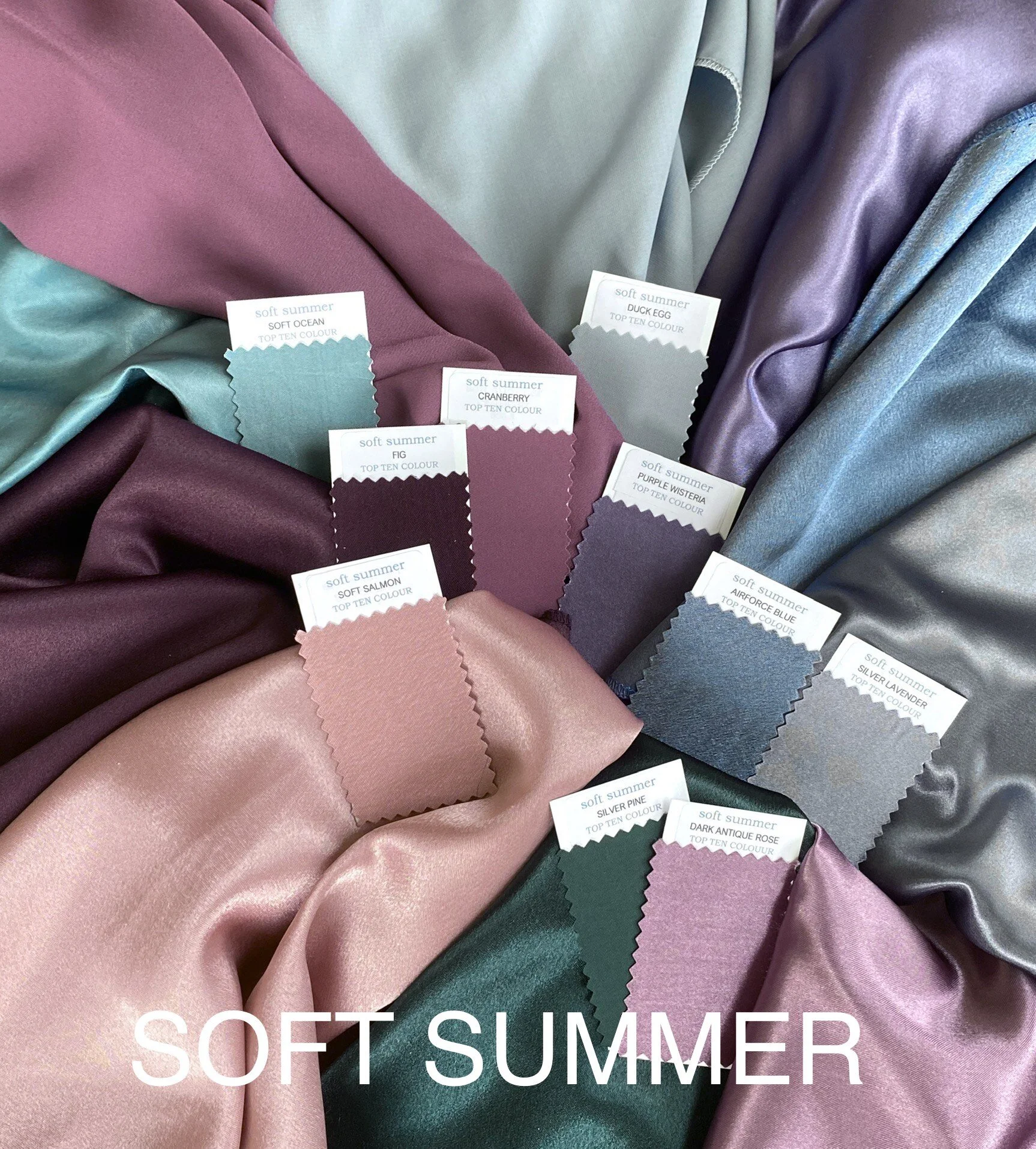
Top Ten Soft Summer Swatches
Available in the shop on this website, or on etsy.
You can see how this palette blends beautifully. Some lovely darks such as the fig, and a lot of medium depth colours. Some are slightly warmed and some are purely cool. The constant is that all of them share the softness in Chroma.
How Soft Summer can add a little brightness
There are times when you might really want a change - a little variety to this beautifully blended palette. It is really difficult to add brightness to your colours without them taking the focus of attention away from your face. I would certainly never put bright colours anywhere near your face. A small accent from the Cool Summer palette away from your face can be fun.
Highlight your best features -
A small pop of colour in your outfit - bag, shoes, belt, bracelet, rings or a small part of a print will provide interesting contrast. It will also draw attention to the point that it sits within your outfit. For example, if you have great legs add a brighter shoe - or a great waist add a narrow belt.

I do love shoes! Shame my legs are my worst feature…..
To give you energy
Sportswear will give you more energy if it is brighter (think of all that neon!) so a brighter top for running may well be worth the sacrifice of not wearing your best colours. There is lots of choice in sportswear for summers - just avoid black bottoms and stick to charcoal or navy.
To enjoy hot weather
Everyone tends to dress brighter on a sunny day - we have a tan (maybe fake), sunglasses, we are surrounded by brightness and energy - it’s natural to reflect it in your clothes especially on holidays. Just don’t go much brighter than your palette or you will disappear behind your outfit and look washed out. Look for prints that have highlights from Cool Summer but are still grounded with your palette - pick up this highlight in your accessories. Try and avoid black sunglass lenses, bright frames, and bright jewellery near your face.
When to use your softest colours
For calm and relaxing moments
Underwear and lingerie - there are some sublime nude and grape shades in your neutrals to really swoon over and these are often available. Also for meditation and relaxation the less energy in your clothing the easier it is to relax and find quiet introspection. Soft Summer neutrals are calmer and gentler than most of your colours - this is the place to go if you want to feel really calm.
To flatter your body
Just as brighter colours will highlight your assets, softer colours will be recessive detracting attention from close attention. Your slightly brighter colours will be the focus for the eye - ideally near your face so that people really notice you. If like me you have big legs relative to a smaller upper body you may choose softer neutrals for the bottom half of an outfit so people look up - denim is perfect for me with colours above the hips.

Your supporting neutral palette
Neutrals are often softer colours as they have to match many colours in your wardrobe and showcase them. They are the supporting vital pieces in your wardrobe that underpin all of the colours. Most of your trousers, jeans, basic tops, shoes, bags, jackets, coats and workwear will be in neutral colours. These need to blend with as much of your wardrobe as possible - so don’t just think navy and grey, also think about greens, dark purples, silvered blues. Colours that can blend with a range of your colours to create outfits that flow into each other just as your colouring flows together so beautifully
Hope you have enjoyed this post - next will be looking at your HUES - the whole colour palette
Thanks for reading
Anni x