


Soft Summer Colour Guide - Part 3 HUES
Anni Wickham
After softness the next most important thins is colours - HUES.
A quote from Kathryn Kalisz founder of Sci Art who created the very first palettes that inspired so many of us:
The Soft Summer tone borders the Autumn season in its depth of colouring. Gentle, yet firmly rooted, the Soft Summer’s tone conveys the richness of the Earth’s natural beauty. where hazy tints of daybreak await the deep and muted shades of dusk
For me Soft Summer is found in a Scottish landscape with mists and hazy layered landscapes revealing heathers, purpled mountains, gentle greens and silvered lochs - all colours gently blurred together through the water in the air. Here are all of the words associated with Soft Summer:

For more inspiration check out my Soft Summer board on my colour stylist pinterest - there are lots of sections under Soft Summer board showing make up, outfits, jewellery, palettes, accessories, people, and inspiration images like this one

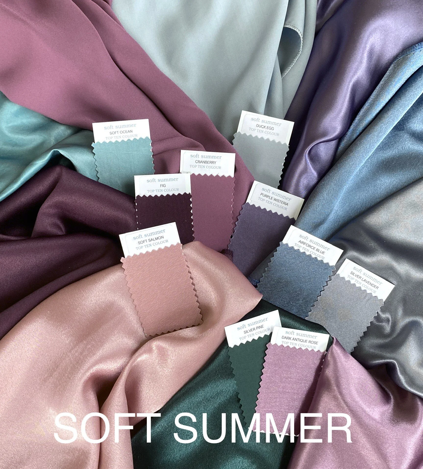
Your colours are cool and gentle. They blend together so beautifully thanks to the silvered softness of the grey running through every colour in the palette. Like Cool Summer you have virtually every blue hue from bluey greens, to blues and then greeny blues. You have mauve purples and lots of pinks.
In addition, from the hint of golden warmth from autumn, you have a few cool beige and pinky beige neutrals taken from your skin tone. You also get a few warmer greens such as moss or tree bark, and at the opposite end of the colour wheel you get warmed pinks like soft salmon and fig.

Your colour wheel has a few complementary colours unlike Cool Summer - you can wear silver pine with a crushed berry, or soft salmon with a rich navy, or purple wisteria with silver mushroom. You always need to make these opposites on the colour wheel have as little contrast as possible - so you need to make them the same depth (VALUE) making the only contrast the HUE as your colours all have the same CHROMA.
Easier to maintain your low contrast level are analogous pairings where you use two colours that are close together on the colour wheel - purple and pink, or pink and blue. Try and avoid blocking or clear boundaries - think of watercolour prints with blurred edges, or dip dye of colours with no clear line between them Cool Summer favours monochromatic where all shades of one colour blend together, and Soft Summer can also look great with these blends - fig and clover, thyme and eau-de-nil.

Now it is time to look at the colours you should avoid. Time to make your shopping much quicker.
Any hues with a strong yellow undertone - warm reds, greens, oranges or yellows. Whilst your neutrals do have some cool beiges creeping in, and mossy greens are appearing along with browned reds - very yellowed colours will still fight with your cool skin.

Hopefully you are looking at all of these and saying “I would never wear that!”
As the previous post showed, you have to rule out all colours brighter than your palette as they will overwhelm your soft features and people will notice the clothes rather than the person. In a future post we will also rule out your very light colours brightened with stark white, and we will discuss black! How dark can you go?
Here is the Soft Summer palette that I use in my colour analysis sessions - I love the way the softness just blends the whole palette together

If you feel that you are on the warmer side of this palette and want to reject the coolest pinks and purples, then Soft Autumn will offer a range of new blues, greens, nude taupes and browns that you can add to your palette. The chroma level matches as does the depth of colours - the only change is that whilst Soft Summer is neutral leaning to cool, Soft Autumn is neutral leaning to warm. There are many colours that you can borrow from each other if you sit nearer neutral.
If you want to reject the warmer pinks and greens, then you can develop your range of cool pinks, grapes, purples and blues. The neutrals offer many variations of grey, navy and purple to add to your palette.
Neutrals are so important, that I am going to dedicate the next post just to them
Hopefully you will continue to follow the series
Thanks for reading
Anni x